


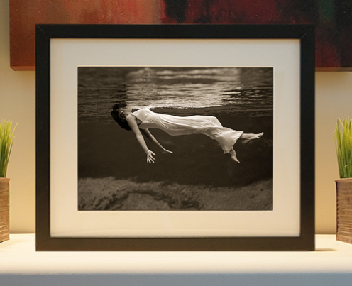
Framed or unframed, desk size to sofa size, printed by us in Arizona and Alabama since 2007. Explore now.
Shorpy is funded by you. Patreon contributors get an ad-free experience.
Learn more.


- Freeze Frame
- Texas Flyer wanted
- Just a Year Too Soon
- WWII -- Replacing men with women at the railroad crossing.
- Yes, Icing
- You kids drive me nuts!
- NOT An Easy Job
- I wonder
- Just add window boxes
- Icing Platform?
- Indiana Harbor Belt abides
- Freezing haze
- Corrections (for those who care)
- C&NW at Nelson
- Fallen Flags
- A dangerous job made worse
- Water Stop
- Passenger trains have right of way over freights?
- Coal
- Never ceases to amaze me.
- Still chuggin' (in model form)
- Great shot
- Westerly Breeze
- For the men, a trapeze
- Tickled
- Sense of loneliness ...
- 2 cents
- Charm City
- What an Outrage
- Brighton Park
Photos submitted by Shorpy members!
Print Emporium
Civil War Scene (Colorized)
")
Colorized from Shorpy. Any suggestions on how to improve the earth colorization? View full size.
Opacity
Use Photoshop and a new layer over it and reduce the opacity. That is the best method!
One last
How do I submit images revised at only 600 Pixels max. You can't see details in my colorized work at only 600 pixels max.
[You've misread the Submit Image instructions; note that the "600" figure refers to the file size in kilobytes, not the image dimensions, and that itself is just a suggestion. The recommended minimum image dimension is 1000 to 1200 pixels wide, although we regularly accept colorized photos as large as 2000 pixels wide.]
[Thank you for the response. Will keep in mind next time.]
Replies
Thanks for the responses, guys. I use CS5. Yes, I grew up around TN waters and most are dingy olive green. The main difficulty I run into when converting to color is the intensity of the colors applied. Do I Multiply the color layer, do I Overlay, or do I simply covert to Colorized monotone. It's interesting to see the results from each.
Any suggestions on how to ......
Blackxacto,
What type of software are you using when colorizing? I use Photoshop and my practice in your picture would be to add a blank layer over the earth layer, select a soft brush and a darker tone in the same color range then paint-in the darker shaded areas. Adjusting the "opacity" settings will also change the results too, you have to play with the settings a bit to suit your imagined color.
Nice work and I hope that this is of some help. Don
Earth
Nice work.
Depends what programme you use (I use Photoshop myself) but you could try reducing the saturation further to a more grey-brown tone, or alternatively (or as well) put down a base-layer of that colour and then brush over some areas with a low opacity feathered brush of a slightly different tone. The vertical "cliffs" could have a slightly more yellow-grey tone.
I like the river colour, as the temptation is to use blue, but the green looks far more natural.
On Shorpy:
Today’s Top 5