


Framed or unframed, desk size to sofa size, printed by us in Arizona and Alabama since 2007. Explore now.
Shorpy is funded by you. Patreon contributors get an ad-free experience.
Learn more.


- Freeze Frame
- Texas Flyer wanted
- Just a Year Too Soon
- WWII -- Replacing men with women at the railroad crossing.
- Yes, Icing
- You kids drive me nuts!
- NOT An Easy Job
- I wonder
- Just add window boxes
- Icing Platform?
- Indiana Harbor Belt abides
- Freezing haze
- Corrections (for those who care)
- C&NW at Nelson
- Fallen Flags
- A dangerous job made worse
- Water Stop
- Passenger trains have right of way over freights?
- Coal
- Never ceases to amaze me.
- Still chuggin' (in model form)
- Great shot
- Westerly Breeze
- For the men, a trapeze
- Tickled
- Sense of loneliness ...
- 2 cents
- Charm City
- What an Outrage
- Brighton Park

Photos submitted by Shorpy members!
Print Emporium
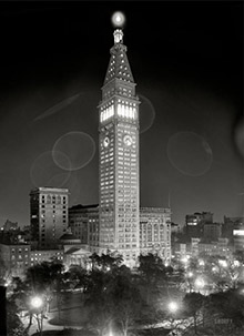

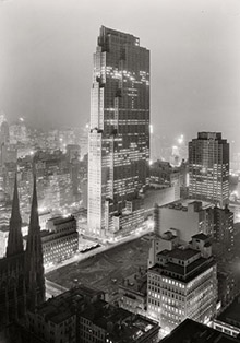

River House: 1931

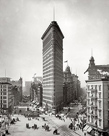
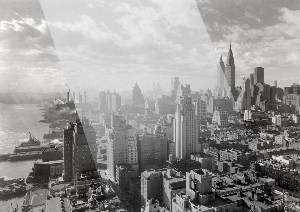
New York. December 15, 1931. "River House, 52nd Street and East River. Parapet, 27th floor, against light." Our second view this week from River House. 5x7 safety negative by Gottscho-Schleisner. View full size.
Tried colourising it

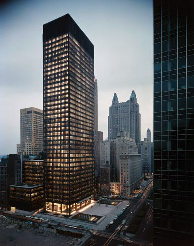
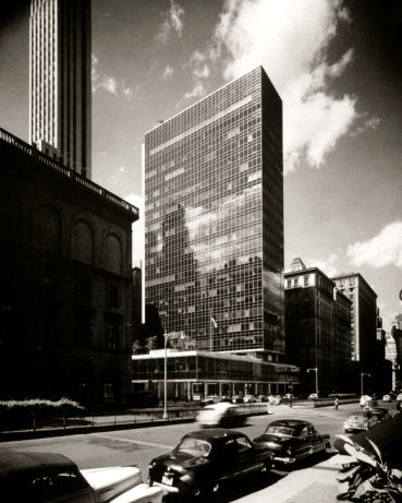
Mies Goodness!
By the tastes of today, a lot of the glass and steel "International Style" towers look kind of ugly. I think the reason for this is that we are used to seeing endless cheap imitations. Literally.
Buildings designed by the original modern masters (Ludwig Mies van der Rohe in particular) were really quite well done. The proportions were great, and the materials used were very attractive -- beautiful, exotic marbles, cladding with copper and other metals - anything that worked to further the elegance of the design.
Unfortunately, it didn't take long for all the other builders to notice the basic, unadorned "boxiness" of it all. Which could mean only one thing...they would be cheap to build! And one would appear to be "Cutting edge" while building them.
So for the next few decades we have been subjected to endless soulless boxes.
Once, according to Mies, Less was more.
Today, less is just what it is -- less.
[If you want the full-bore Miesian experience, it's hard to beat pulling up to his Seagram Building on Park Avenue for dinner at that temple of International Stylishness, the Four Seasons. Which hasn't changed a bit since it opened in 1959, and for good reason. - Dave]
How Sam Did It
Samuel Gottscho's remarkable shots were adjusted at the shooting and negative stages - no need to modify the print, if any, by different exposures to different sections. (Today's digital equivalent would be High Dynamic Range (HDR) - different exposures for shadows and highlights.)
Light meters were unavailable in 1931, so he would have used rules of thumb as a starting point, such as the film instruction sheet or maybe "Sunny Sixteen" (on a bright day at f16, the shutter speed is close to the reciprocal of the film speed).
He also had a great eye for how much to overexpose to bring out shadow detail. In the River House shot, for example, he probably added 1-2 stops extra to bring out the near side of the railing and other shadowed areas. This would make the highlights go white and textureless, so he'd then underdevelop using various available methods (reduced time, diluted developer, waterbath, etc) so the highlights wouldn't block up.
He may also have used ortho film, which actually lets you watch the development's progress with a red safelight.
The result is marvelous quality if it works and a ruined negative if it doesn't. Despite his eye, I'll bet he took a whole armload of different exposures.
Bill
[There is not much contrast in the original negatives (milky middle sections of the images below -- click to enlarge). The clouds are barely visible. We adjust shadows and highlights in Photoshop before posting them. - Dave]

Swanky!
Nick and Nora Charles must be having martinis just out of frame to the right.
Glass and steel
Well a few glass and steel buildings are ok I guess (though I've never really seen what the heck is so wonderful about Lever House or the Seagram Building - and I used to pass them all the time.) But when they predominate they just get boring boring boring. They turn the city into a blank shiny wall. And at street level they are worse. They give nothing to the life of the street.
And nothing on earth could make a good Art Deco skyscraper look dowdy! They are always romantic to me.
"Dead End" again
The book "Celluloid Skyline" is a great history of how New York City has been portrayed in film. It details the re-creation of River House for the movie "Dead End."
How deep is the bedrock?
One reason that the Empire State Building has stood out against the Big Apple skyline from any direction save the view to the southwest of River House, where the Chrysler Building still looms more magnificently, is that the bedrock support for foundations at the location of the ESB, at Fifth Avenue and 34th Street, lies far below the surface. That's why today, in a panoramic skyline view of Manhattan, that you see such a wide stretch of lower buildings only, constructed between the Wall Street area and Midtown beginning at about 38th Street.
Engineers would have to do very deep and expensive excavation to build a skyscraper anywhere near the ESB.
Why?
I look at that and I wonder why the Chrysler Building did not get all of the recognition it deserved when compared to The Empire State Building. I can only think that it must be because pictures like this weren't widely distributed at the time.
When people heard that The Empire State Building was the tallest building in the world, I'm sure it sounded very, very impressive, but when you see the two buildings in a shot like this, there is no mistaking which is the more impressive edifice.
[What's impressive about the Empire State, in person at least, is its bulk -- with 2.1 million square feet of floor space, almost twice as big the Chrysler. And of course 300 feet taller. - Dave]
Re: Antenna
The large antenna mast that we see now, or at least its predecessor, was not added until 1952. It pretty much looked like that until then. In fact, the top was originally meant to be a mooring mast for dirigibles (airships).
No Antenna..
There is no antenna on the Empire State Building. Did King Kong tear it off?
[It was still under construction. - Dave]
A Gottscho Fan
Samuel Gottscho certainly was a master at composition, exposure, and printing. Most people setting up that skyline shot would have made sure to eliminate the wall in the foreground, but Sam makes it work.
Judging from the tonal range, he was a genius at the old standby "Expose for the shadows and develop for the highlights". To which the Photoshop generation would say, "Whaaa?"
[There is no print. Our Gottscho images (like almost all of images on this site) are made from scanning the original negatives, digitally inverting (reversing) them to get a positive, and then adjusting shadows and highlights in Photoshop. - Dave]
Hazy day
He forgot to crop out the fog machines on the left.
Yachting
When River House was built, its back lawn extended to the East River. The building had its own dock for a few years. The construction of the FDR (East River) Drive caused the co-op to lose its river frontage.
Beautiful
Even with those smoke stacks belching out their junk, NYC looks beautiful. But we all know that those steel and glass monstrosities are on their way.
[Personally I think the "glass boxes" are rather elegant. They make their predecessors look a bit dowdy. I can't imagine New York without the Seagram Building, Lever House or the UN Secretariat. - Dave]
The Great...
For some reason this picture just reminds me of the Great Gatsby...
Gotham
This looks like a city where Batman would battle crime and injustice.
Dead End
River House was the original of the posh apartment house which directly abutted the slums in Sidney Kinglsey's play (and later the movie) Dead End.
So if you looked off to the side of this apartment you might see TB, Spit, Angel and all dem guys roasting a few mickies or jumping off the pier!
Cinematic
Man, that looks like an old matte painting from a movie ... crazy!
Underwater
Love the sea horses in the grilles.
On Shorpy:
Today’s Top 5