


Framed or unframed, desk size to sofa size, printed by us in Arizona and Alabama since 2007. Explore now.
Shorpy is funded by you. Patreon contributors get an ad-free experience.
Learn more.


- Freeze Frame
- Texas Flyer wanted
- Just a Year Too Soon
- WWII -- Replacing men with women at the railroad crossing.
- Yes, Icing
- You kids drive me nuts!
- NOT An Easy Job
- I wonder
- Just add window boxes
- Icing Platform?
- Indiana Harbor Belt abides
- Freezing haze
- Corrections (for those who care)
- C&NW at Nelson
- Fallen Flags
- A dangerous job made worse
- Water Stop
- Passenger trains have right of way over freights?
- Coal
- Never ceases to amaze me.
- Still chuggin' (in model form)
- Great shot
- Westerly Breeze
- For the men, a trapeze
- Tickled
- Sense of loneliness ...
- 2 cents
- Charm City
- What an Outrage
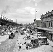
- Brighton Park
Photos submitted by Shorpy members!
Print Emporium


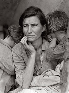
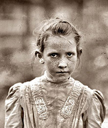
Migrant Mother colorized, 1937

This is the coloration of Dorothea Lange's iconic 'Migrant Mother' photo. The stark reality of Dorothea's original photograph is actuated by the addition of color, which I think brings out detail not apparent in the black & white original. View full size.
So much more impactful in B&W
This is a prime example of why things shouldn't be colorized.
Missing the message
Something about putting this in color takes away from how I've always seen it. Technically, the coloration is alright, but it shouldn't be done on this photograph. It's like if Picasso had painted the Old Guitarist with something other than blue. It's just not the same.
Nice
I like it in color. It makes you realize those people are just like us - not from another world where everything is b/w.
Hey You are Pretty Good!
Shame about the "artistic" overtures. As long as the orginals are intact I fail to see a problem with your "talent" being exhibited here. I've seen both, and both pieces of work have merit. I like it.
"Dorothea"
Here an "o", put it where you want. Sometimes your fingers get ahead of your thoughts and you miss your mistakes.
La belleza de la tristeza
Que tristeza en su mirada perdida, que foto mas significativa, toda la pena del mundo , su hambre y necesidad a cuestas, con sus niñas siempre a su lado
¿alguien sabe que le ocurriò a ella y sus niñas?.
Miles de Doroteas circulan cada dìa por Sudamerica y USA, y nunca las vemos, son invisibles a nuestra mirada, y aun asi Ds nos pedira cuentas de todas ellas, de las miradas que no quisimos ver, del hambre que no mitigamos, del pan o la moneda que negamos, de la puerta que cerramos en las narices, de todas las faltas de oportunidad que negamos.
Actualmente la crisis hace aparecer Doroteas, desempleadas, que deben alimentar a sus hijos. Ojala nos sirva de leccion esto y seamos mas sensibles al dolor humano.
I Agree
I do agree that some images lend themselves to colourising & some do not. This one falls into the "do not" category.
As for colourising in general, the skintones in particular are very flat - for a more natural result, have you thought about using a gradient map adjustment layer? In conjunction with painting in subtle colour graduation, I use them for skintones, hair, etc when colouring b&w images. It removes that flatness & artificiality. I also find that your skintones are often too saturated & peachy.
Fantastic. Keep it up.
Oh how I love the over-the-top expressions of outrage!
Kenny, this one is very cool. I would really have trouble identifying this as a colorized photo.
I enjoy the highly stylized colorizations that hint at tinting or the idiosyncrasies of early color film. But this one really stands out for its stunning realism. Thanks.
Doesn't do it for me.
This is why some photographers still use B/W. Colour dilutes the drama.
Awful. Leave it alone.
This is sacrilege. How about I come over to your house and spraypaint your white car purple? If you have any respect for the artist--keep your hands off. If you want to express yourself creatively, create your own work.
Just not the same
Very good job, I like it. Just not the same feeling to it as in the B&W.
On Shorpy:
Today’s Top 5