

Framed or unframed, desk size to sofa size, printed by us in Arizona and Alabama since 2007. Explore now.
Shorpy is funded by you. Patreon contributors get an ad-free experience.
Learn more.

- Freeze Frame
- Texas Flyer wanted
- Just a Year Too Soon
- WWII -- Replacing men with women at the railroad crossing.
- Yes, Icing
- You kids drive me nuts!
- NOT An Easy Job
- I wonder
- Just add window boxes
- Icing Platform?
- Indiana Harbor Belt abides
- Freezing haze
- Corrections (for those who care)
- C&NW at Nelson
- Fallen Flags
- A dangerous job made worse
- Water Stop
- Passenger trains have right of way over freights?
- Coal
- Never ceases to amaze me.
- Still chuggin' (in model form)
- Great shot
- Westerly Breeze
- For the men, a trapeze
- Tickled
- Sense of loneliness ...
- 2 cents
- Charm City
- What an Outrage
- Brighton Park
Print Emporium
Streamline Moderne
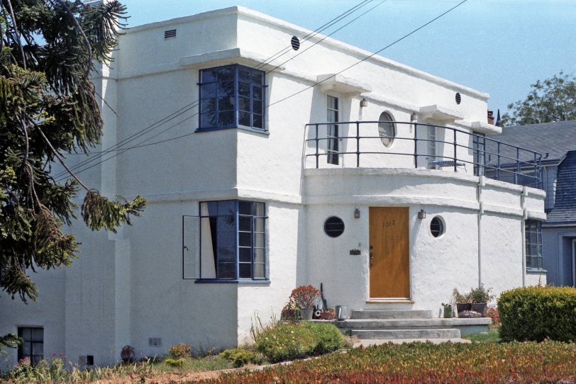
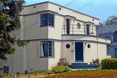
A classic example of 1930s Streamline Moderne architecture in a Santa Cruz, California house I photographed in 1984, showing a number of characteristic elements: porthole and corner windows, the rounded edge of the entryway, the flat roof and white stucco surfaces. Unfortunately, the current Google street view shows it's acquired a color scheme not in keeping with the spirit of the style. A 35mm Kodacolor negative. View full size.
"Colorized"
You know, I don't think the grayed terra cotta color is so bad, even if it is not "historical". But with blue trim? No, no, no. Imagine it with charcoal-black trim... A HUGE improvement. "Smart" even!
Now I thought the off-white version with blue trim was handsome. But where did they come up with the design for that hideous blue awning? Awnings should always be architectural, not just some shape chosen because someone "likes" it.
At any rate, the important thing is that the house survives largely intact, with the original windows, and in this day and age that's a minor triumph.
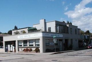
Here's another super Santa Cruz Modernist moment: a terrace apartment over a commercial ground floor. Pretty swanky...
I Like dwig's Version
My understanding of Streamline Moderne is that the principal colour shouldn't be as glaringly white as in tterrace's 1984 photo but more of an off-white to beige. dwig has that part right. I also like the more subdued blue than the modern version of the house that he uses for the trim and that he uses it more extensively than was the case in the 1984 photo. I'm not sure that it's historically accurate to use the colour on the body of the house but for me it works.
It doesn't surprise me that this style was touted in the 1930s. It was an outgrowth of both the Art Deco Movement which would culminate with the buildings for the 1939 World's Fair, and the streamline design movement which dominated industrial design most notably by people like Raymond Loewy. America loved it's Art Deco, and I suspect we would have seen more houses like this - at least in the United States - if the recovery from the Great Depression hadn't been so tied with World War II.
No big deal
Well, if they felt compelled to change something about the house, at least it was only the paint. Why wouldn't I be surprised if SpongeBob SquarePants walked out that front door?
Mixed feelings
On the one hand, the colors aren't true to the Streamline Moderne style, but paint can be changed. One Moderne house in my hometown was 'improved' by adding a typical sloped roof on top of the flat roof.
In the past, as now, many flat roofs were covered in tar.
1930s House of the future?
If you look at home design and decor magazines from about 1935 the pages frequently feature houses looking much like this example and tout them as the future of residential architecture, something which really didn't happen. Here in Southern California, many newly built homes are Spanish or Monterey style with very similar design features to the extant & coveted 1920s-30s period revival homes of our pre WW2 suburbs.
I agree
I lived down the street from this house from 1968 through 1975. I agree this great old Streamline Moderne home should be white and trimmed as your old photo shows. Currently, it is a toad, for sure, pretending to be Southwest for all I can tell in an adobe sort of color. It can be Google Earthed: 1012 3rd street, Santa Cruz, CA. This is the historic Beach Hill district of Santa Cruz, overlooking the historic Boardwalk and the fifth oldest roller coaster in the USA, built in 1924, The Giant Dipper, probably worthy of a Shorpy series in itself!
Streamline Moderne Rules
According to Wikipedia, the new colour scheme is wrong because it is too dark. Streamline Moderne structures featured "subdued colours: base colours were typically light earth tones, off-whites, or beiges; and trim colors were typically dark colors (or bright metals) to contrast from the light base." In this photo the white house may be a bit too stark, but the dark grey or metal trim around the windows is just right. In the modern view the terra cotta main paint is a bit too aggressive but what really sticks out is the bright blue trim. It shouts, while Streamline Moderne - which is an off-shoot of the Art Deco style movement is subtle.
Stucco- yuck
The stucco looks like a recent 1980's job. Bad one at that. I bet when it was first built (1930's) it was smoother and held cleaner and crisper horizontal lines. This one just looks bad.
Fascinating
I love being able to see it on street view today. I know today flat roofs use a thick rubber as a first layer then cover it with gravel. What was used back when this house was built? I kind of like the new color scheme.











On Shorpy:
Today’s Top 5