

Framed or unframed, desk size to sofa size, printed by us in Arizona and Alabama since 2007. Explore now.
Shorpy is funded by you. Patreon contributors get an ad-free experience.
Learn more.

- Details, Details
- What's that building to the left of the tower?
- Coal Barges
- Bromo-Seltzer
- Inner harbor
- The Basin
- What a headache!
- Giant stepladder?
- Baldwin 62303
- Baldwin VO-1000
- Cold
- No expense spared
- Tough Guys
- Lost in Toyland
- And without gloves
- If I were a blindfolded time traveler
- Smoke Consumer Also Cooks
- Oh that stove!
- Possibly still there?
- What?!?
- $100 Reward
- Freeze Frame
- Texas Flyer wanted
- Just a Year Too Soon
- WWII -- Replacing men with women at the railroad crossing.
- Yes, Icing
- You kids drive me nuts!
- NOT An Easy Job
- I wonder
- Just add window boxes
Print Emporium
Kitchen Fresh: 1956
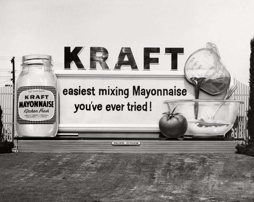
Los Angeles circa 1956. "KRAFT -- easiest mixing Mayonnaise you've ever tried!" No. 6 in a series of billboard photos from the files of Pacific Outdoor Advertising. View full size.
Art to me
I love the billboard series. Each one has been (to me) a work of art. Even the frame construction and skirting of the older billboards are so much nicer than today. I can do with a few less of the current renditions.
Bouncing Baby Letters
tterrace - that is a great example. The uneven lettering is called "bounce" by graphic designers, typesetters and sign painters. Yes, there are still a few sign painters around.
Uneven lettering
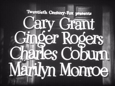
The uneven letter placement pinstripe52 mentions was a design/layout shtick intended to convey an easygoing, lighthearted or humorous mood. You'd also see it used in comedy film opening title sequences. 20th Century-Fox was a great one for doing that in the 1950s, like this from 1952's "Monkey Business."
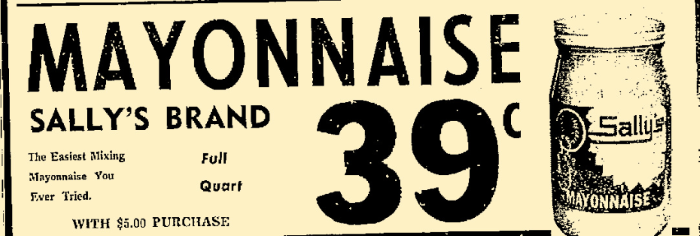
Dear Sally ...
Kraft's phrase "the easiest mixing mayonnaise ever" had a run of less than two years, in 1956 and 1957, before it dropped out of use. While few shoppers may have cared whether Kraft's mayo was easy-mixing, the ad writer at a grocery store in Greenville, Mississippi, decided in November 1957 to borrow Kraft's phrase word-for-word, to promote its "Sally's Mayonnaise" product.
Sign layout
I immediately noticed the uneven horizontal placement of the letters in the headline (easiest mixing ... ) Also the vertical strokes are not consistent in length. Perhaps the sign painter forgot his snap line that day?
Most likely not, as I suspect it was an intentional design by some creative art director. Back then it was not at all unusual to use hand lettering in advertising, something very lacking today. It immediately caught my eye and is very subtly pleasing.
Mix with what?
Notwithstanding the tomato, my brain reads that thick, black stuff as chocolate. Tomato juice isn't that thick. Color would help. But what does one mix with mayo? Where's the tuna?
[It would be oil and/or vinegar, for a salad dressing. - Dave]
Don't be like Janet
She used the hard-to-mix mayonnaise.
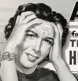
Andy was not far
Seeing these exceptional billboards, it's no wonder Pop Art sprang up so strong in the late '50s and '60s.
Measuring cup
Pyrex or Anchor Hocking? I’m tempted to go with the latter. I have three in the kitchen (one-, two-, and four-cup) with the scale for cups and ounces on one side and, since it’s Canada, metric on the other.








On Shorpy:
Today’s Top 5