


Framed or unframed, desk size to sofa size, printed by us in Arizona and Alabama since 2007. Explore now.
Shorpy is funded by you. Patreon contributors get an ad-free experience.
Learn more.


- Baldwin 62303
- Baldwin VO-1000
- Cold
- No expense spared
- Tough Guys
- Lost in Toyland
- And without gloves
- If I were a blindfolded time traveler
- Smoke Consumer Also Cooks
- Oh that stove!
- Possibly still there?
- What?!?
- $100 Reward
- Freeze Frame
- Texas Flyer wanted
- Just a Year Too Soon
- WWII -- Replacing men with women at the railroad crossing.
- Yes, Icing
- You kids drive me nuts!
- NOT An Easy Job
- I wonder
- Just add window boxes
- Icing Platform?
- Indiana Harbor Belt abides
- Freezing haze
- Corrections (for those who care)
- C&NW at Nelson
- Fallen Flags
- A dangerous job made worse
- Water Stop
Photos submitted by Shorpy members!
Print Emporium

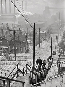
Meat and Potatoes: 1941

April 1941. "South Side market, Chicago." With security at the door. 35mm nitrate negative by Russell Lee for the Farm Security Administration. View full size.
Kids in old images.
I love the ones with little children. Assuming that the little boy is about 4 in the picture then he was born in 1936. He could still be alive today at 83 years of age. It makes you wonder if anyone that was in these old shots happens across their own past staring back at them.
[As my sixth-grade teacher used to say: Check your math. - Dave]
I love that girl's shoes.
She sure looks to have a lot on her mind, but still manages to be a snappy dresser.
Great shot
I love the price difference between Neck Bone and Pork Chop. Also the bottles of RC inside, above the Coke ads. Heh.
Russell Lee's photo
This is one of the best composed shots on this site. The lighting is beautiful.
Sigh
The children's faces are haunting. Sign painting is a skill, a trade, out of work artists still freelance trimming windows. The signs are at "eye level", that's the logic. Good picture, Dave, more than good.
Where I Live
$3.62 a pound for pork chops is a pretty good price. And beef kidneys? As George Gobel used to say, "You don't hardly get those any more."
Fantastic Shot
This shot is one of my favorites so far. Not because of any one particular subject but rather the overall composition and feel... As a matter of fact, I think this is very Robert Frank-ish and about fifteen years before his important and controversial book "The Americans" was published (1958). I have always loved great black and white documentary photography and this image is a fine example.
Repetitive advertising
Today's back-to-back Geico commercials have nothing on these four (FOUR?) Coca Cola signs out front. Think they got their point across? Pepsi and RC reps need not waste their time here!
Inflation
Those prices are not cheap. According to the inflation calculator, that 25-cent pork chop would cost $3.62 in 2008 prices.
Retailing 101
Whoever the artist was that drew the white specials signs in the rectangular spaces on the window glass knew their stuff. The two word titles and the prices are spaced just about perfect. This was done freehand with perhaps a flat edge (a ruler?) to guide him or her. Good bet it was the owner or a worker in the store. They used the center row of seven panes and left the top and bottom so that inside of the store was still visible. They get an A for advertising and another for marketing.
On Shorpy:
Today’s Top 5