


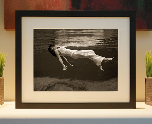
Framed or unframed, desk size to sofa size, printed by us in Arizona and Alabama since 2007. Explore now.
Shorpy is funded by you. Patreon contributors get an ad-free experience.
Learn more.


- Baldwin 62303
- Baldwin VO-1000
- Cold
- No expense spared
- Tough Guys
- Lost in Toyland
- And without gloves
- If I were a blindfolded time traveler
- Smoke Consumer Also Cooks
- Oh that stove!
- Possibly still there?
- What?!?
- $100 Reward
- Freeze Frame
- Texas Flyer wanted
- Just a Year Too Soon
- WWII -- Replacing men with women at the railroad crossing.
- Yes, Icing
- You kids drive me nuts!
- NOT An Easy Job
- I wonder
- Just add window boxes
- Icing Platform?
- Indiana Harbor Belt abides
- Freezing haze
- Corrections (for those who care)
- C&NW at Nelson
- Fallen Flags
- A dangerous job made worse
- Water Stop
Photos submitted by Shorpy members!
Print Emporium
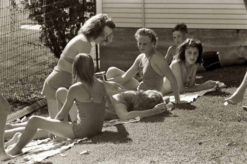
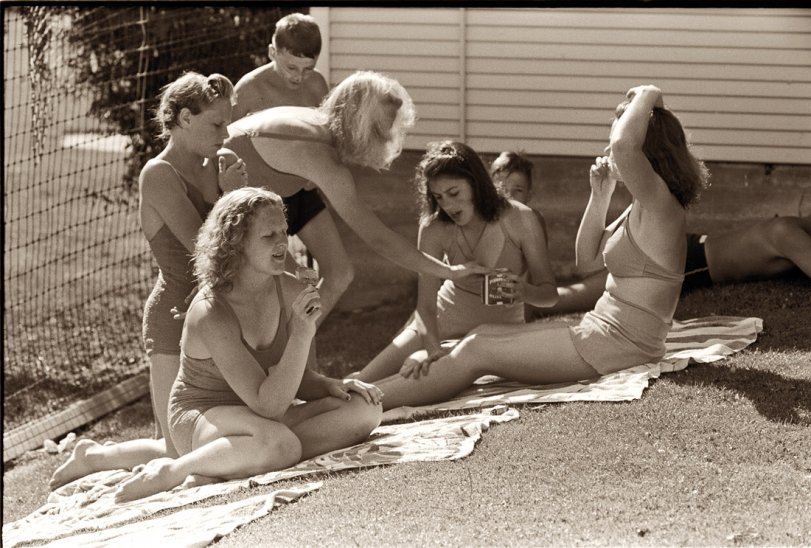
The Summer of '41, 2.0

A colorized version of Russell Lee's "Summer of '41," posted here in 2007. View full size. I wrote an article for Rangefinder Publishing's AfterCapture magazine detailing my technique. You can download "Colorizing a Memory" here.
"Everyone is turning colors"
So I'm guessing that the commentors who don't care for colorization were revolted by the movie "Pleasantville."
"What do you want to do to me right now? Come on. Everyone is turning colors. Kids are making out in the street. No one is getting their dinner. Hell, you could have a flood any minute! Pretty soon, the women could be going off to work, while the men stayed at home and cooked!" -- David in "Pleasantville"

Colorization goes back many years
I have a photo that used to hang on my grandmother's bedroom wall that was colorized, in 1900. I am not sure if it was the photographer, or someone else, but whoever it was dated their work on the back. I haven't liked many of the colorized things I have seen online, because the colors are too bright, in many of them. There are a few that I like, though, including this one, and I certainly don't see any harm in it! If someone painted the original, and there were no copies, I would be upset, but I don't think there is anyone here who would do that, anyway!
Purple Bikini
Check out the pipes on her!
Was she the local arm-wrestling champ, or something? Maybe the popsicle is part of her training diet.
Re: Kodachrome Emulation
I'm pretty sure that whatever method Alienskin uses to approximate Kodachrome's "look" is based on modern samples.
The Kodachrome emulsion of 60 years ago was very different, with a color balance that favored yellows and reds. You could probably use the Alienskin Exposure2 plugin as a starting point, but you'd need to do additional color correction to dial an image's color to match the old Kodachrome look.
Mouthwatering...
I mean of course the grape flavor popsicle. I have a small supply of grape soda imported from the US in the refrigerator for good humor moments like these and I'm gonna open one right now. Grape popsicles are a big part of my childhood memories of summer. Just like the small of Coppertone. or the taste of a peanut butter and jelly sandwich.
Great work. Thanks for the tutorial. You mentioned Kodachrome and the Alienskin plugin. I want to emulate Kodachrome so that color photos will look like the Kodachrome images here on Shorpy.
Even with the plug-in I've had no luck trying, the effect doesn't even come close. Any ideas?
Color me impressed
John, this is fabulous. I'm relatively new to colorizing, and while it's a lot of fun, I find my results a little disappointing at times. Thanks to your description of how you achieve more natural skin tones, I now know why. To all the colorizing detractors: colorizing an old picture is like being a kid and getting a new coloring book and a big box of Crayolas. It doesn't damage the original, for which the colorizer still has the utmost respect. It's just fun to see an old image brought to life by imagining it as we would see it had we been there to witness it in person. It brings a freshness and an immediacy to the image. We don't see in black and white. Tea said it best: "...adding color makes it look like it was only yesterday."
I couldn't disagree more
I couldn't disagree more strongly on the anti-colorization sentiments. The original B/W image still remains so where is the downside? The upside is an incredible view of the past that is more familiar to us or perhaps more consistent with our present context. I LOVE the colorized version. It transports me back to that time and places me in the picture for sure. It is like watching B/W WWII footage versus color footage. The difference is staggering.
Keep up the awesome work!
Little Pink Houses, or I Don't Believe in Yesterday
Why, exactly, should a photograph originally taken nearly 70 years ago look as though it "was taken yesterday"? What is gained? If an original photo was taken in black and white because color photography wasn't available or affordable to the photographer or just because he or she wanted it in black and white, I don't see how primping it up improves anything. I hope nobody goes after Mathew Brady's work with this process.
Fun With Color
I enjoy seeing what can be done. No harm done, it's another way to have fun, and it brings out details you might miss in the original (per the grape popsicle). Advice to Colorists: never leave anything uncolored even if it is supposed to be grey (such as the concrete wall). Real life surfaces are mottled, and shadows take on subtle colors reflected from nearby patches of light. Aside from this, this picture is very convincing.
Re: Colorization Sucks
No doubt, some folks don't or won't like the idea of adding subjective color to a monochromatic image. However, it is a visual technique capable of revitalizing precious memories.
I've done colorizations for family members of deceased loved ones in which they wish to memorialize and remember the family member as they appeared in life.
Life is not black and white—it is in color. The addition of well-applied color to a b/w photograph is sometimes the only way to heighten the sense of life the subjects once possessed. The result is often emotionally overwhelming for the family members upon first viewing.
It's not necessarily a matter of "if it ain't broke, don't fix it.". Sometimes it's a matter of "if it adds life, enhance it."
A STUPENDOUS job.
A STUPENDOUS job. And how bizarre that just adding color makes it look like it was only yesterday. Except for the swimsuits, which are a bit different, and the fact that people aren't actively TRYING to crisp themselves anymore (Olive oil!? -- I thought the baby oil phase was bad) people seem still much the same, lying around in the yard, goofing off.
Colorization Sucks!
No matter how good the so-called "artist" might be at it, it reminds me of the "fake stereo" records of my childhood, where classic recordings by Bessie Smith and Duke Ellington and Jelly Roll Morton and other 1920's, 30's and 40's musicians would be "enhanced" with echo-chamber effects, phasing, and other such audio fakery before they were sold as LP collections to a public that had never heard the originals.
Never mind that the original musicians and recording engineers had nothing of the sort in mind— this technical effing around was considered an "improvement" by the utter morons who were responsible for all those travesties.
Old saying, origin unknown: "If it ain't broke, don't fix it!"
Backyard Beach
Love the grape Popsicle! Suntan oil came in a can??
[It's a can of Pompeiian olive oil. Click to enlarge. - Dave]
Nice work!
I especially like the realistic flesh tones. They're among the hardest colors to get right.
On Shorpy:
Today’s Top 5