


Framed or unframed, desk size to sofa size, printed by us in Arizona and Alabama since 2007. Explore now.
Shorpy is funded by you. Patreon contributors get an ad-free experience.
Learn more.


- Roll your own
- Rugged and real!
- A Charles Purcell - Mama Cass Connection
- Uncle SAAM
- Obfuscation
- One Chocolate Soldier rode away
- Victor Marquis de la Roche
- The Little House Across Way ...
- Vanderbilt Gates
- Vanderbilt Mansion
- You can still see that gate
- Withering heights for me
- So Jim,
- Top Heavy
- Re: Can't Place It.
- Bus ID
- Since you mention it
- The White Pages ?
- Moonlight Tower
- 1907?
- Fire(men) and Water
- Can't Place It
- Can anyone
- Wings
- Where's Claudette and Clark?
- Overbuilt Rolodex
- One song
- Give Me Wings Please!
- PRR
- Pinball Wizards

Photos submitted by Shorpy members!
Printporium


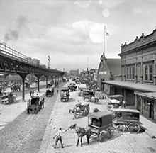

Pacific Mutual: 1909

Los Angeles circa 1909. "Pacific Mutual Life & Accident Co. building, Sixth and Olive streets." 8x10 inch dry plate glass negative, Detroit Publishing Company. View full size.
Deco-rating

Beauty
is in the eye of the beholder.....and I really like the 1909 version a lot more!
They must have had VERY spacious offices back then with such large windows,
did the Detroit Publishing Company do indoor photos a la Gottscho-Schleisner, too??
Not so bad after all
I disagree with timotheus; the architect of this Beaux-Arts building knew how to handle the Classical orders quite well. The colossal Corinthian pilasters and columns are correct in every detail; the columns taper towards the top, as they should, while the pilasters are ramrod straight. The impressive pileup at the corner is worthy to stand comparison with the work of Michelangelo at St. Peter's or that of Ange-Jacques Gabriel at the Petit Trianon. The entablature is correctly detailed and proportioned, although the treatment of the frieze (the horizontal band with the small horizontally oriented windows) is somewhat unorthodox precisely because of those same windows. But it is certainly not beyond the pale. True, the whole thing might look better without the attic story on top, but still ... Despite the domineering presence of the large-scale Classical elements, the use of vast amounts of window wall filling out every inch of space between the columns and pilasters makes this building analogous to the glazed "skin and bones" designs of the Chicago School architects of the turn of the century. I think the design is distinctly better than the pallid Art Deco shroud that replaced this exuberant facade in the 1930s.
Egads!
What a monstrosity! Like someone took parts from a classical architecture guide and threw them together with no concept of how they were supposed to work in proportion. Long gone, thank goodness.
[Not long gone, just remodeled with a Moderne makeover in 1936. -- Dave]
On Shorpy:
Today’s Top 5