


Framed or unframed, desk size to sofa size, printed by us in Arizona and Alabama since 2007. Explore now.
Shorpy is funded by you. Patreon contributors get an ad-free experience.
Learn more.


- Baldwin 62303
- Baldwin VO-1000
- Cold
- No expense spared
- Tough Guys
- Lost in Toyland
- And without gloves
- If I were a blindfolded time traveler
- Smoke Consumer Also Cooks
- Oh that stove!
- Possibly still there?
- What?!?
- $100 Reward
- Freeze Frame
- Texas Flyer wanted
- Just a Year Too Soon
- WWII -- Replacing men with women at the railroad crossing.
- Yes, Icing
- You kids drive me nuts!
- NOT An Easy Job
- I wonder
- Just add window boxes
- Icing Platform?
- Indiana Harbor Belt abides
- Freezing haze
- Corrections (for those who care)
- C&NW at Nelson
- Fallen Flags
- A dangerous job made worse
- Water Stop
Photos submitted by Shorpy members!
Print Emporium
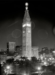
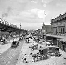
North Terminal, Boston: 1890s

I've seen some colorized pictures here but have never tried one myself. When I saw this picture I thought I'd make an attempt, to see if I could give a feel for what it must have been like to be there. I didn't base my color choices on any actual reference, just what looked OK. It didn't come out as well as I'd have liked, but it's still interesting. View full size.
Exceptional Work
You've done a wonderful job giving life to this image. I congratulate you on carefully rendering the skyline and buiding roofs. Roof line details are carefully masked and add so much to the realism. Great job. I see more work to be done in the buildings in the distance but what an incredible start.
Right on
It's amazing how close this looks to the real thing, especially since you didn't use references. I did a quick image search and found this image taken from a postcard.
Apparently the building was demolished in 1927

Living Color
Wonderful job, truly makes you feel like you are there!
A case of shingles
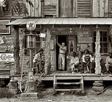
Very nice! But isn't that slate on those mansards? Should be dark grey or black.
Dept. of Redundancy Dept.
Very nice colorization. As noted by another commenter, the color brings out some details that weren't as evident in B/W.
A sample for colours?
The scene reminds me of John O'Connor's 1884 painting (now in the Museum of London) of London's St.Pancras Station, also built of red brick, as seen in the distance.
The detail and amount of junk in the right foreground suggest that this had an original photograph. The road surface seems to be brown even though the pavement is grey. The brickwork of the houses is very grubby, especially the chimneys, and the whole sky is full of smoke.
Nice sunset though!

Delightful!
Just wanted to add my voice to the chorus of praise.
The GAHHHDEN!!!
As someone commented on the B&W photo, this is approximately where the TD BankNorth Garden is now on Causeway Street. I'll be going there tonight to see the Bruins play.
Life with colors
Excellent job, Dave! Of course now that we know how talented you are we will expect only color photos from Shorpy from now on!
[Well thank you, but did you check to see who submitted this image? Not me! - Dave]
But Seriously, I know purists don't like colorization but I think it gives a much more accurate rendition than monochrome photos. I'm reminded of my then young daughter browsing through my mother's photo album and remarking that she was glad she didn't grow up when I did. I asked her why and she said because it must have been boring living without colors. We all got a good chuckle out of that, but the irony is I remember the 1950s as an era of very bold bright colors (especially on cars) which shows how misleading monochrome photography is.
Lovely!
You picked a doozy of a picture for a first attempt and did a great job with it, so congratulations!
I don't know about anyone else, but colorizing a picture always makes me feel a much stronger connection to the place/person/whatever I'm colorizing.
OUTSTANDING!!!
That is excellent work. Let me ask; How long did it take you? The degree of detail (flowers in window boxes) is just great. Thanks and God bless!
Pax Christi
Rev. Joel+
Thanks!
Thanks for the kind words! For those who asked, I used Photoshop and it took about five hours or so (I didn't do it in one sitting so it's hard to tell). Of course most of that time was trying different colors-- a lot of "do" and "undo."
Most of the colors are just layers ("Bricks" "People" "Sky" etc.) set to Overlay mode and the opacity set anywhere from 25% to 75%. I also had the original image in three layers at the bottom: The original at the bottom, then one that was tinted blue, then one that was tinted slightly sepia. For windows I erased the sepia one to reveal the blueish one underneath. And for some things I also erased the blue one to reveal the B&W original. Adjusting the color saturation of the sepia layer would have the effect of boosting the saturation in all of the color layers, although I did final color correcting after flattening the image.
On the technical end it's VERY easy. It's the artistic end that takes the time.
There's GOT to be a way to do this so it doesn't look colorized. Some time I'll study it some more and give it a shot on another picture, probably (hopefully) a Civil War-era photo.
Now you've done it
Oh, great! Now that I see your colorized photo, I realize I'm going to have to go back through all 652 pages of Shorpy's to see what else I've missed! When I first looked at the B&W, I barely gave it a second glance. Wow, I missed a lot of detail that the color brought out. Well done!!
Now if only my wife doesn't notice me starting over at the beginning...
Re: Technicolor
Wow. Looks like a movie set.
That was my first thought also, I can imagine Judy Garland walking down that street.
Excellent work on the colours BTW.
Color choices
This isn't intended as a criticism of the colorization job - which I think is pretty impressively accomplished - just my own musings and speculations about the colors we would have seen back then, and mainly, the color of dirt and dust, and how pervasive it is, particularly on city streets.
Most people probably think dirt is brownish, or at least has some color to it, but unless there's a predominant local source that's fairly constant - like near quarry that mines a distinctly colored mineral - dirt and dust consists mostly of a varied mixture of substances that blend together into a neutral gray. This is aided by carbon content, such as from motor vehicles or, in times gone by, coal. That's why the best color for your car's upholstery, and particularly its carpets, is medium gray - the dirt and dust don't show.
So I think a street like this, even though it's paved with bricks, would most likely look grayish, with perhaps only a hint of red. I think this would also tend to mute the color of the buildings to some extent. Also, sun and weathering usually bleach the color out of wood surfaces, and I think this would be particularly true of a high-traffic area like the loading dock. Anyway, a most arresting colorization job, particularly the three-dimensional quality it imparts.
Oops - I hadn't noticed BobE's earlier soot comment, which addresses the same point.
Love the details!
Wonderful work! As a colorizer myself, I'm naturally curious about what process you used. Photoshop? Coloriage? How long did this take you?
I love your attention to the smallest details. Colorizing those can be maddening but it's one of the most important qualities that determine a colorizing's effectiveness.
Got any more?
Gorgeous hard work
As a image editing aficionado myself I love the attention paid to the little details. Wow, hard work. And yes, it gives us a closer vision to the beauty of those buildings... and times.
Beautiful Boston!
I want to step right into the photo! The colorization seems perfect, and it really brings out so much detail!
Now I'm nostalgic & homesick!
Technicolor
Wow. Looks like a movie set.
Fantastic
I also like to colorize old family and old sports pictures. This one is just very awesome! What software did you use and how long did this take?
I agree with Tinag
I too have been mystified by the enthusiasm with which the hobby of "scrapbooking" has become so huge and their practice of cutting out (important) background scenery and sticking on commercially manufactured identical stickers and gaudy distractions which in my humble opinion not only distracts immensely from the subject of each picture but makes it look fake. I so enjoy looking at my old family albums, just black and white pictures (and some colored) in little paper photo corners which really enhances the subject in the photo and also allows one to scrutinize the background with a magnifier for hidden, unexpected and very telling details. Personally, I think future photo viewers will wish their relatives had not done away with all the background in old photos. Why would we even look at Shorpy if all the scenery was cut out? I don't want to start a debate, I'm just sayin...
Where's the soot?
It looks very romantic, and I'm sure that a postcard colourist of the day would have made it look like this, but I suspect that most of it was really a distinct sooty colour.
Fantastic!
I love this photo as colorized! Brings out a lot of detail that I would have otherwise missed.
I cannot spot any pigeons. Perhaps AT is referring to the insulated connections at the cable intersections?
Feather in your cap
Just amazing. I like your attention to even the smallest of details - even down to the little pigeon standing on the cable. Thank you!
Have Some Crazy Fun Next Time
I guess if you had a few cocktails in you before colorizing you could make the men look like mummers, the women like tropical birds, and the horses polka-dotted. Rainbow colored brick buildings, anyone?
Amazing
Even the color of the horse poop is vivid, real.
Slates for the mansard
Lots of detail really pops out, but the one thing that caught my eye were the tan/buff colored shingles on the Mansard roof. Sure seems to me these should be some darker typical slate colors (grays, even green or blue for accents).
I like seeing the colorized photos as long as it's clear they're speculations.
Wow
Fantastic effort and deserves all the best comments. A small nit pick is that the window boxes on the window sill of the buildimg on the right of the picture could do with some vibrant colours for the foliage and the flowers. That aside it is much better than anything I could do.
Beautifully done
Your judgment about what colors and hues to use was dead on. It looks "right."
Details, Details
As one who enjoys colorizing black & white photos, I must say that you did an excellent job for your first endevor. I have found that when colorizing, I become aware of details that I might otherwise overlook. Colorizing is not to take anything away from the original black & white photos, but a method of studying the photo and appreciating it more.
Very nice
fwtep did a good job for a first try! I love the details, in color and B&W. I've always thought it was silly the way "scrapbookers" remove the backgrounds (what they see as the "excess") from pictures of people and buildings. It always turns out that the background is the most interesting part.
I'm sure this picture was taken of the building itself, but it's the stuff going on that's so fascinating to us now.
On Shorpy:
Today’s Top 5